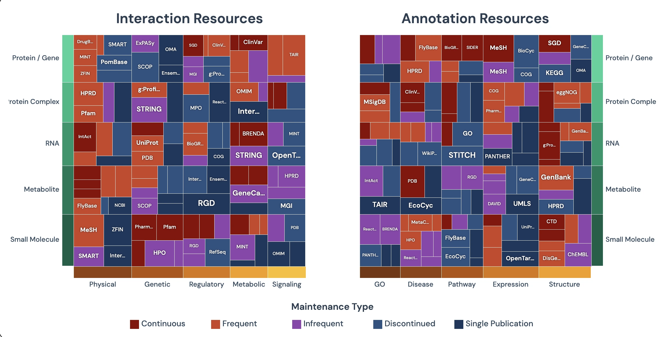
Partitioned Grid Visualization
Interactive visualization showing biomedical database resources organized by maintenance status and data types. Explore connections between entities, interactions, and annotations.
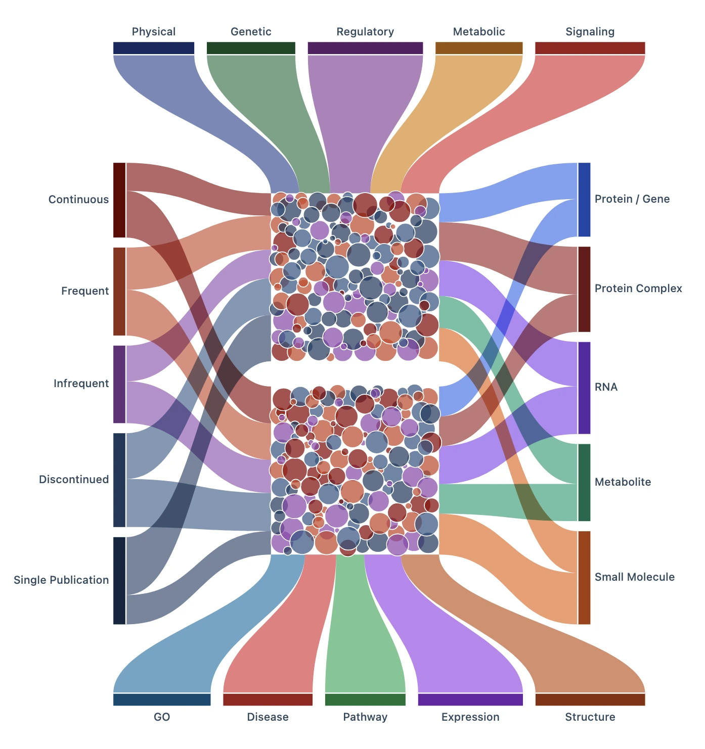
Sankey Hub Visualization
Sankey diagram showing flow of biomedical data through interaction and annotation hubs. Visualizes relationships between maintenance categories, entity types, and data flows.
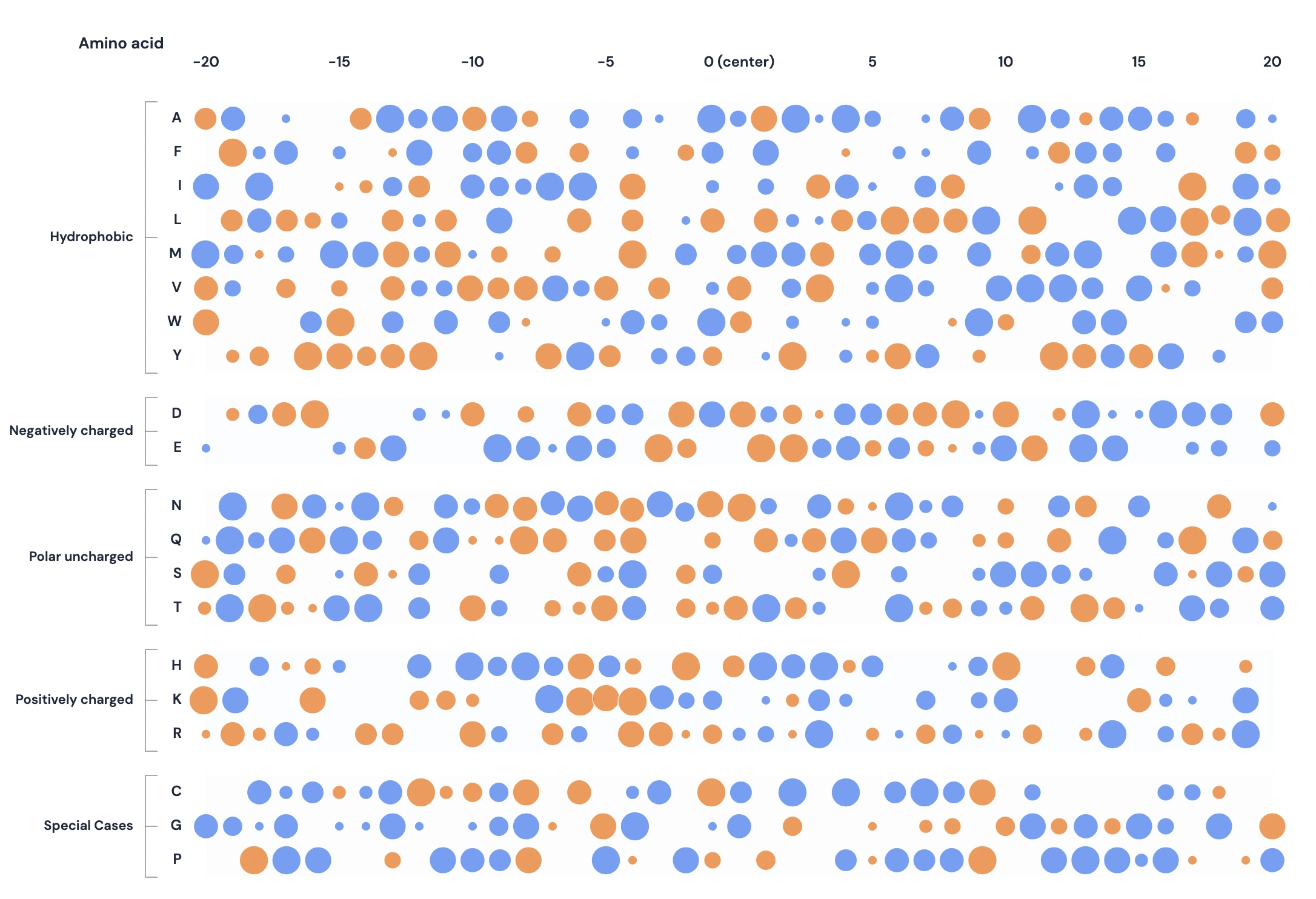
Peptide Experiment Visualization
Interactive dot plot visualization showing peptide experiment results where each position displays amino acid substitutions with IC50 outcomes. Circle size represents the number of data points, while color indicates good (blue) or bad (orange) IC50 values.
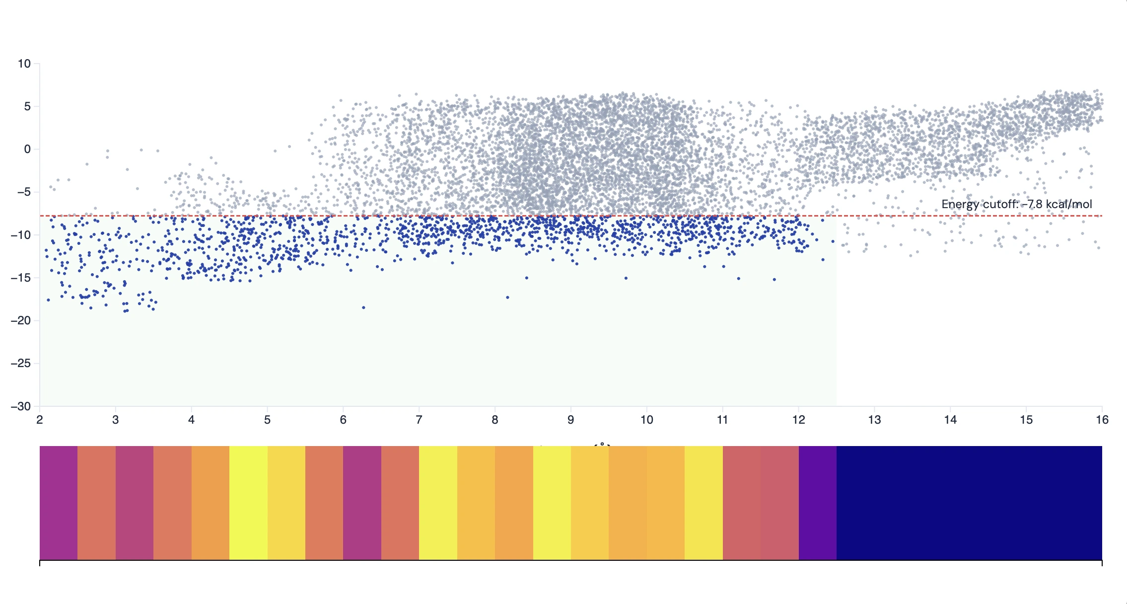
Docking Results Visualization
Interactive visualization of molecular docking results showing the relationship between interaction energy scores and distance measurements. Features a scatter plot with filtering criteria and a histogram heatmap below.